In the ever-evolving realm of technology, the significance of a seamless online presence cannot be overstated. As businesses strive to captivate their audience and stay ahead in the digital race, the spotlight turns to the pivotal role of responsive web design. In this article, we will delve into the profound importance of a responsive web design, exploring its impact on user experience, search engine optimization (SEO), and the overall success of a digital presence.
Understanding Responsive Web Design
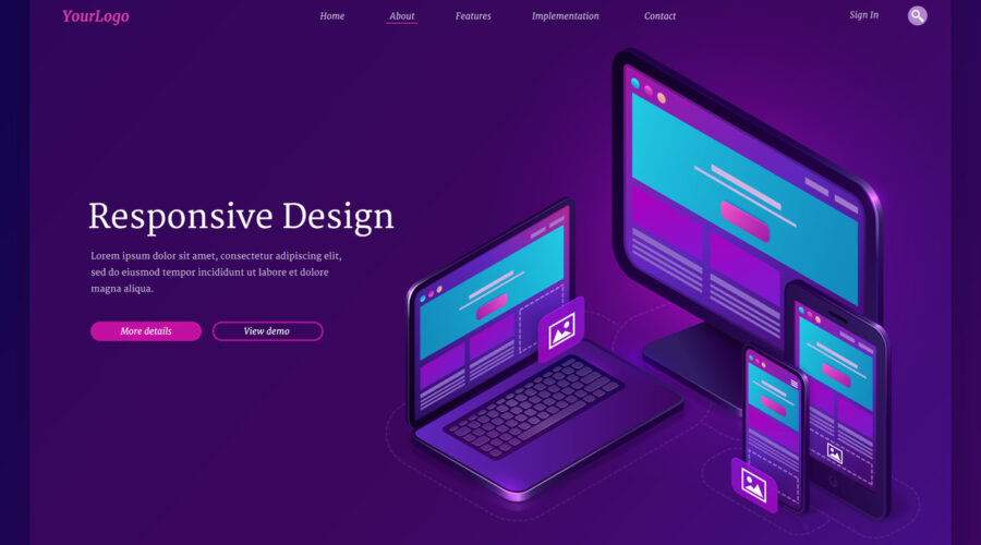
Responsive web design is a dynamic approach to crafting websites that ensures optimal viewing and interaction across a variety of devices, including desktops, laptops, tablets, and smartphones. In essence, it allows a website to adapt its layout and functionality based on the screen size and orientation of the device being used. This adaptability is not merely a design luxury but has evolved into a necessity, given the diverse array of devices through which users access the internet today.
Enhancing User Experience
At the core of responsive web design lies an unwavering commitment to delivering an exceptional user experience. In an era where attention spans are shrinking and competition for user engagement is fierce, a website’s ability to provide a seamless and user-friendly experience is a game-changer.
Consider a scenario where a potential customer visits your website on a smartphone. Without responsive design, the user may encounter distorted layouts, misplaced content, and a cumbersome navigation experience. Such an encounter often leads to frustration, prompting users to abandon the site and seek alternatives. On the contrary, a responsive web design ensures that the website adjusts fluidly, offering a consistent and engaging experience across all devices. This not only enhances user satisfaction but also contributes to increased retention rates and improved conversion opportunities.
SEO Benefits of Responsive Design
Search engines, led by the behemoth Google, play a pivotal role in directing online traffic. The algorithms used by search engines prioritize user experience as a key factor in determining search rankings. Responsive web design aligns seamlessly with these algorithms, offering a website that is both user-friendly and easy for search engines to crawl.
Google, in particular, has endorsed responsive design as the preferred mobile configuration, making it a crucial element for achieving higher search rankings. A responsive website eliminates the need for multiple URLs and device-specific strategies, streamlining the management of content and ensuring a consistent online identity. This not only simplifies the SEO process but also contributes to a more effective and cohesive digital marketing strategy.
Cost-Efficiency and Maintenance
Traditionally, businesses would develop separate versions of their websites to accommodate different devices – a desktop version and a mobile version. However, this approach is not only time-consuming but also significantly more expensive in terms of development and maintenance. Responsive web design offers a cost-effective solution by presenting a single, fluid design that adapts to various screen sizes.
Moreover, maintaining multiple versions of a website can lead to inconsistencies in content, design, and functionality. With a responsive design, updates and changes can be implemented seamlessly across all devices, ensuring uniformity and minimizing the risk of discrepancies. This not only streamlines the maintenance process but also contributes to a cohesive brand identity across the digital landscape.
Adapting to the Mobile-First Era
The rise of mobile devices as the primary means of internet access has ushered in a new era – the mobile-first era. With a significant portion of online traffic originating from smartphones and tablets, businesses must prioritize the mobile user experience. Responsive web design inherently aligns with this shift, ensuring that your website is optimized for the smaller screens and touch interfaces of mobile devices.
By embracing a mobile-first approach, businesses can tap into a broader audience and cater to the preferences of modern consumers. Whether users are on the go, relaxing at home, or multitasking, a responsive website guarantees a consistent and enjoyable experience, fostering user engagement and loyalty.
The Future-Proof Solution
In the fast-paced world of technology, anticipating future trends and advancements is a constant challenge. Responsive web design, however, stands out as a future-proof solution that adapts to the evolving digital landscape. As new devices and screen sizes emerge, a responsive website will seamlessly adjust, ensuring that your online presence remains cutting-edge and relevant.
Investing in responsive web design is not merely a one-time enhancement but an ongoing commitment to staying ahead in the digital curve. As technology continues to evolve, a responsive website serves as a foundation for embracing new opportunities and technologies, positioning your business for sustained success in the ever-changing digital arena.
Conclusion
In conclusion, the importance of responsive web design cannot be overstated in today’s digital landscape. It is the cornerstone of a superior user experience, a key driver of SEO success, and a cost-effective solution for businesses looking to streamline their online presence. As we navigate the complexities of the digital age, embracing responsive web design is not just an option; it is a strategic imperative for businesses aiming to thrive in the competitive online ecosystem.
At Orqa Tech, we understand the pivotal role that responsive web design plays in shaping the online success of businesses. Our commitment to innovative solutions and cutting-edge technologies empowers businesses to embrace the full potential of the digital landscape. By prioritizing a responsive web design, you not only cater to the diverse needs of your audience but also lay the foundation for a future-proof and resilient online presence. Let’s discuss your journey to digital transformation with us.